www.inpayne.com/models/kitbash/trekpage_saipan.html
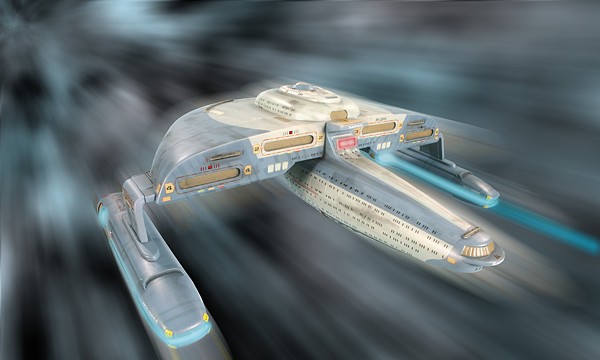
USS Saipan
Added on October 26th, 2012 by HoChunk | Report Post
Tags:Art, Awesome Things, Fantasy - Science Fiction, Star Trek
Tags:Art, Awesome Things, Fantasy - Science Fiction, Star Trek


Is it just me, or does the Federation have some of the most retarded looking ships?
Nope. Not just you.
Here… let’s fight. Oh look, I just targeted *one* of your warp pylons. Now you can’t jump away. Also: now going to work on that absurd “neck” of your ship. You know; the bit that connects all of the important stuff to that disk with the command pimple sitting out in the open?. Yeah… that one.
Don’t worry, there is a backup “battle bridge” that we never use because we KNOW the bridge is in a stupid position.
Okay, I’m with you on the bridge positioning. The ideal location would be deep within the superstructure, for obvious reasons.
Better than Romulan ships, which look like they want to maximize their surface area and long, skinny structures.
The original series has an excuse because there was no consensus at the time of what spaceships should look like aside from real life rocket ships. After that, they should have minimized the similarity to the original enterprise, not take it and make it more extreme.
Star Trek ships clearly are designed to rely on their shields to protect them (which is pretty much the case, as they almost always imply that one photon torpedo will destroy most ships if their shields go down).
You know you have a point! I always wondered why the Federation ships never targeted those thin neck sections of the Romulan Warbirds and cut the ships “head” clean off?
Technically, this is something that some random dude came up with and isn’t canon.
Designing a spacecraft for mass-market entertainment (as opposed to designing one for, say, NASA,) means treading a fine line between something that is visually interesting/looks cool, and something that doesn’t completely insult your intelligence. I can live with warp pylons and saucer/engineering sections separated by thin “necks” if a relatively plausible reason is given (TNG coming up with ‘saucer separation’ was a stroke of brilliance.) But planet-mining energy beams suspended on miles-long chains with spikes all over them? Are you shitting me?
No one even counts that one…
Fair cop…okay then: DS9, where the docking pylons are pointing inwards from the main ring, towards each other, leaving minimal space for the ships to actually dock. Why the fuck didn’t they just have them radiate outward? You could fit a hundred more ships on it that way.
You know, I consider myself a Trekkie. Not a die-hard, but nothing is going to change the fact that this ship has a dick.
Isn’t energy and matter free in the Star Trek universe? Are these the kinds of ships you’d build if you had basically no limitations?