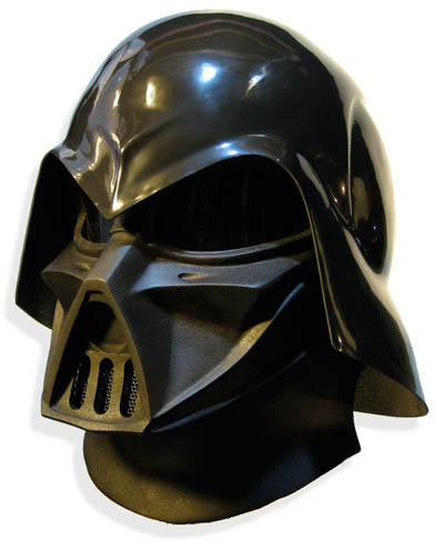
Whilst it would be all too easy to view this Conceptual Darth Vader Helmet, realised by Kropserkel Design, as a refreshingly modern take on Darth Vader’s Helmet, the somewhat surprising fact is that, though it undoubtedly looks more modern than the original as featured in the cult sci-fi Star Wars films, this work is actually based on Ralph McQuarrie’s original illustrations that subsequently evolved into Vader as we know him today.
Perhaps serving as testament to the widely accepted idea that style and trends tend to repeat themselves in somewhat of a cycle (rather than evolving in a merely linear fashion), were we to place the original Darth Vader Helmet and this conceptual model together and ask which of the two was the more modern design we’ll warrant, with some confidence, that those asked would label this conceptual work as indisputably being a modern interpretation of the original. And, to be fair, who could blame them?
Darth Vader New and Old
Vader old and new (or is it new and old?)
Rather than merely paraphrase the original text concerning this fascinating project here we would urge those interested to stop by the Kropserkel website for further information concerning the realization of Darth Vader as he may have been (its a great read).


Oh yeah I prefer the original helmet. That’s absolutely true, about how trends repeat themselves in a cycle. This has been messing with me for quite some time, why is it that the way people dressed in the 90s seems so ridiculous, while the 50s were so incredibly hip. So 50 years from now they should think that people imitating the 50s today looked stupid while people from the 90s were the bomb. I just can’t imagine that. This makes me feel like a guinea pig in a lab, and all these cycles are just being tested on us. I also think everyone should dress like Americans used to dress in the 50s forever so everyone can be beautiful and people on the streets could do the jitterbug while not being laughed at. It would be a new era if we did that for at least 60 years. The scientists in the aforementioned lab would lose their jobs or win a Nobel prize, depending on their supervisor.
The 50’s? Guys in the 50’s had jeans, a shirt and a jacket (preferably leather). That’s about how I dress when it’s not too warm and not to cold (but without leather, can’t find a decent jacket at a decent price).
When it’s boiling hot: cargo pants and a light colored or colorful t-shirt. So basically 90’s surfer.
When it’s nippy I dress like a hobo, so 80’s.
And when it’s “where’s my penis?!” cold I stay inside.
You don’t know much about the 50s, do you. www.youtube.com/watch?v=cbaNYWkQYYA
Haha, 1944.
I was thinking Fonzy.
I just put my flared leg pants in long term storage. If my waistline holds out I’ll be able to wear them again in 15-20 years or so. I think the cycle speeds up the greater the population concerned. As it becomes harder for people to express their individuality they look look to the past for inspiration.
What was my point? Oh yeah, I don’t care what style I’m wearing.
And penis joke.
I prefer the helmet as seen in the movie. It makes Vader a bad as leader; a Dark Lord of the Sith.
The “more modern” version makes him look like a Sith Marauder; a throw-a-way warrior.
Lame. Like Maul.
I wouldn’t take Darth Vader serious if he had that modern helmet on, too cartooney
I don’t like the modern helmet either. The arched brow and protrusion in the middle show too much ’emotion’, making him seem angry or as said, cartoonish. The helmet used in the movie is more neutral, but still dark, which comes across as cold and calculated, which is how I like my Darths.
This is my take on it as well… Vaders helmet really aught not show any emotion. I could go with a few more of the shaper angles, but ideally it would give no emotional cues at all, but still retain it’s dark, sinister aura…
The first mask looks really evil, but the original is just so emotionless. And that’s why it works. Vader nearly lost what made him a human, so why not reflect it in a robotic face?